Chart presentation user interface of LeoDataAnalysis
The data presentation and statistical modeling is visually presented as a chart at the working screen of LeoDataAnalysis.
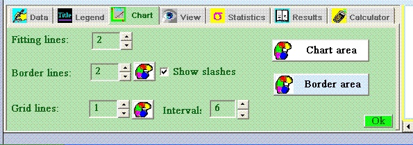
There are several options to decorate a produced picture with help of tools in "Chart" tabs of Control panel.
There are following operations supported:
Edit background.
To edit background colors of chart area or borders around it
click on corresponding buttons of "Chart" tab of control panel.
Edit lines. Thickness of border, grid and fitting lines can be modified with the help of corresponding edit or spin controls. The color can be changed directly only for border and grid lines on the "Chart" control. The color of fitting lines the sane as color of approximated formulas are the same as color of marks of value parameters and can be edited in the "Data" tab of control panel.
Tip: Any variation in way of the chart presentation initiates a recalculation and repainting of the picture. For not too large number of the records it´s not a matter of concern but for thousands of records it could be. To avoid this effect make all parameters inactive during editing of the chart.